People want meaning.
Raw numbers create anxiety; a single interpreted signal creates confidence.
 A CREATIVE POINT OF VIEW
Complex health. One calm signal.
End-to-end design of a consumer wellness app that turns vascular health into a single, calm, trend-based score. I led UX research, product design, the design system, and the marketing site — from zero to a live App Store launch.
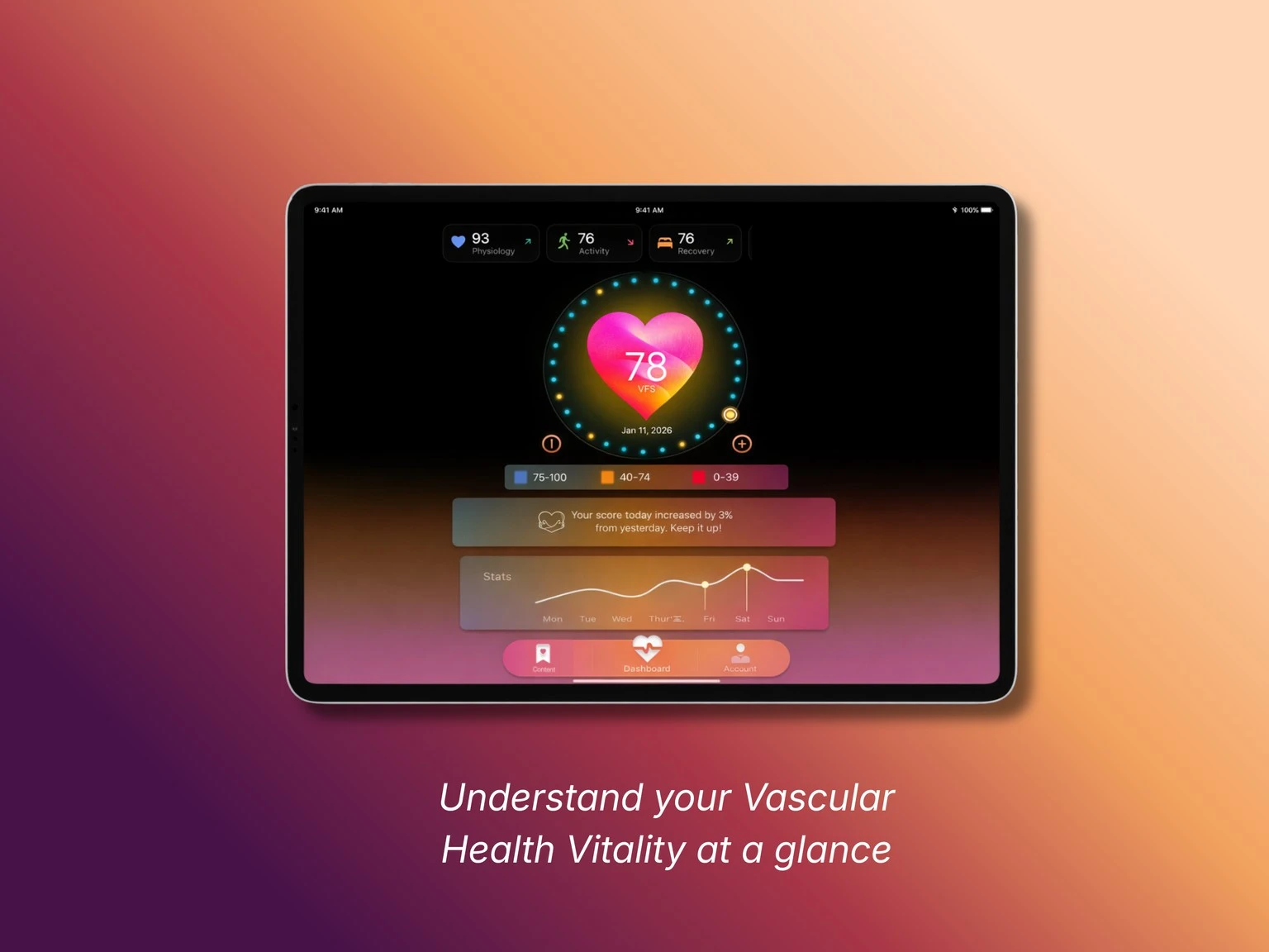
Most health apps overwhelm people. They surface individual readings, spikes, and alerts, and quietly turn wellness into a source of anxiety. But vascular health doesn’t change in a day — it’s shaped gradually, over months of small choices.
How do you help someone understand a complex, invisible part of their health without making them feel judged, overwhelmed, or medicalized?
I ran user interviews to understand how people actually relate to health tracking. Those conversations surfaced four behavioral archetypes — from the data-hungry Quantified Optimizer to the anxiety-driven Worried-Well — that split along two axes: how much effort someone wants to invest, and whether they’re seeking data mastery or reassurance.
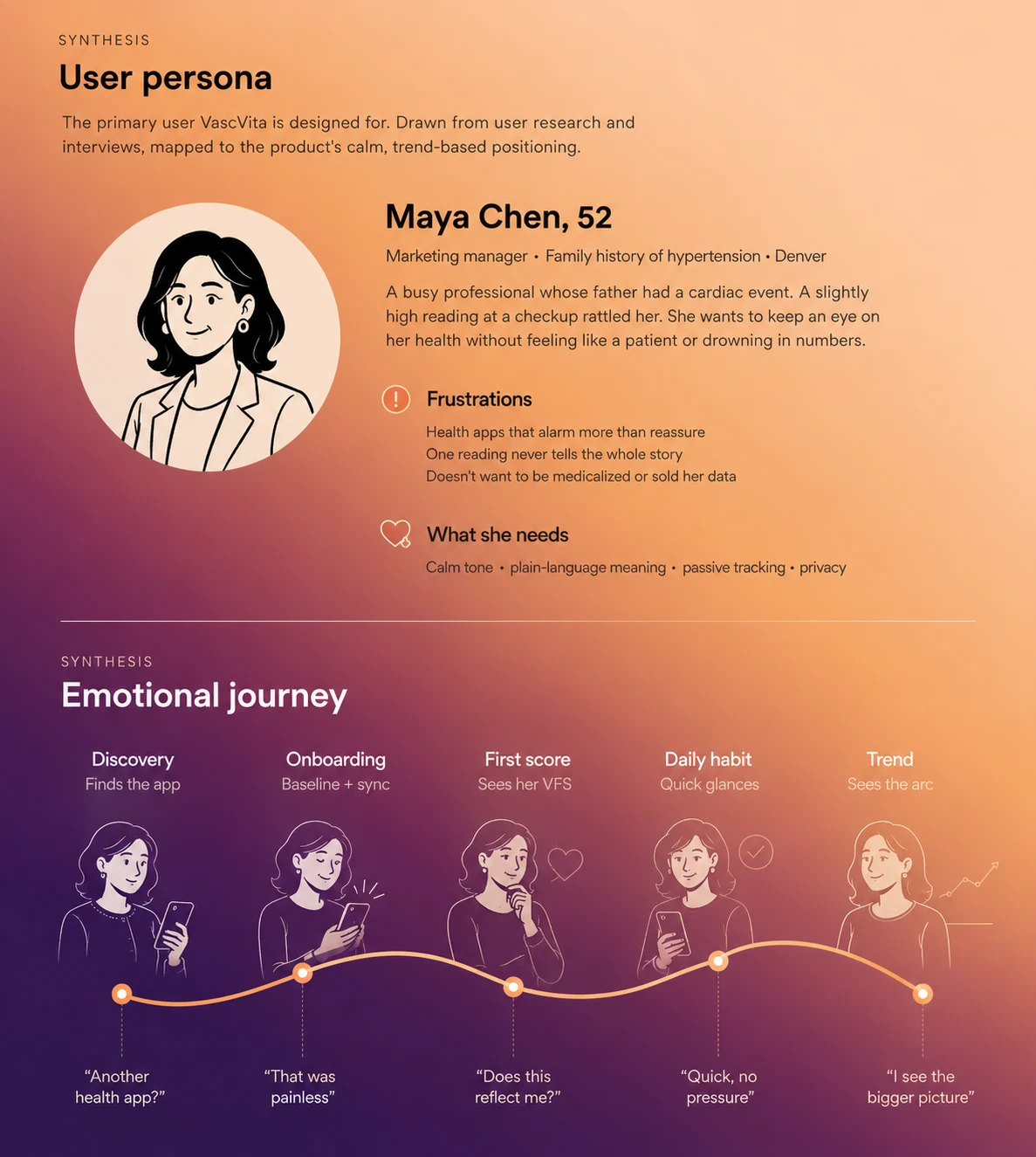
Raw numbers create anxiety; a single interpreted signal creates confidence.
Anything that has to be logged manually gets abandoned. Passive collection is the sustainable path.
For the worried user, one alarming notification can be enough to lose them. Calm is part of retention.
We built VascVita around one principle — trends over readings, calm over pressure. Instead of a dashboard of vitals, everything distills into a single Vascular Fitness Score (VFS) from 1 to 100, shown as it moves over weeks and months.
From the first sketch, the score was always a ring — one number surrounded by the day’s inputs. Early on I was working through the color logic, how verified versus estimated blood pressure should read visually, and how to show a 30-day window without turning it into a chart.
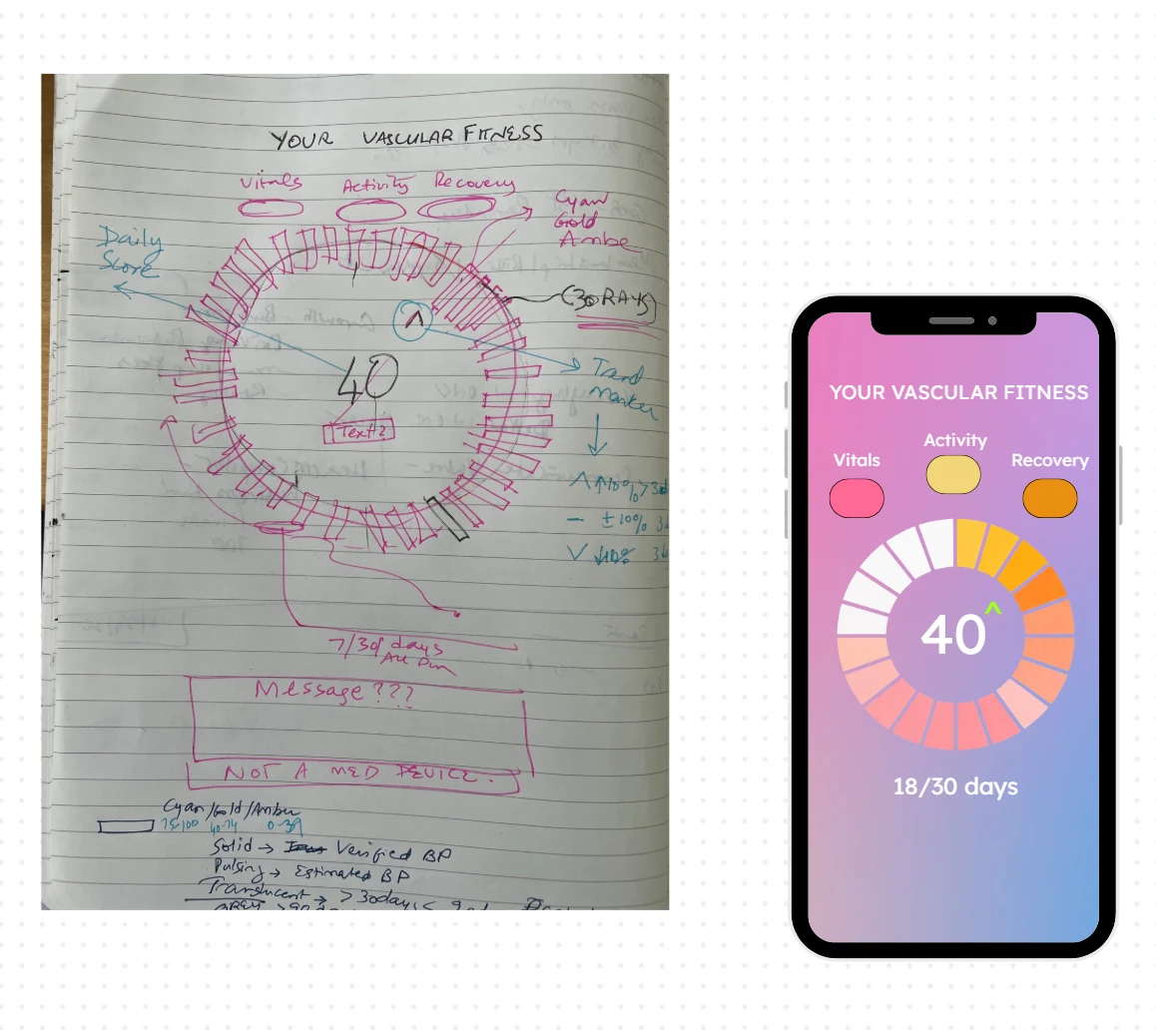
The Health Ring is the heart of the app — the single glanceable view of your score and the day’s inputs. It started on paper. The lo-fi stage is where I resolved structure over aesthetics — hierarchy, what earns the top of the screen, and how someone moves from the daily glance into detail.
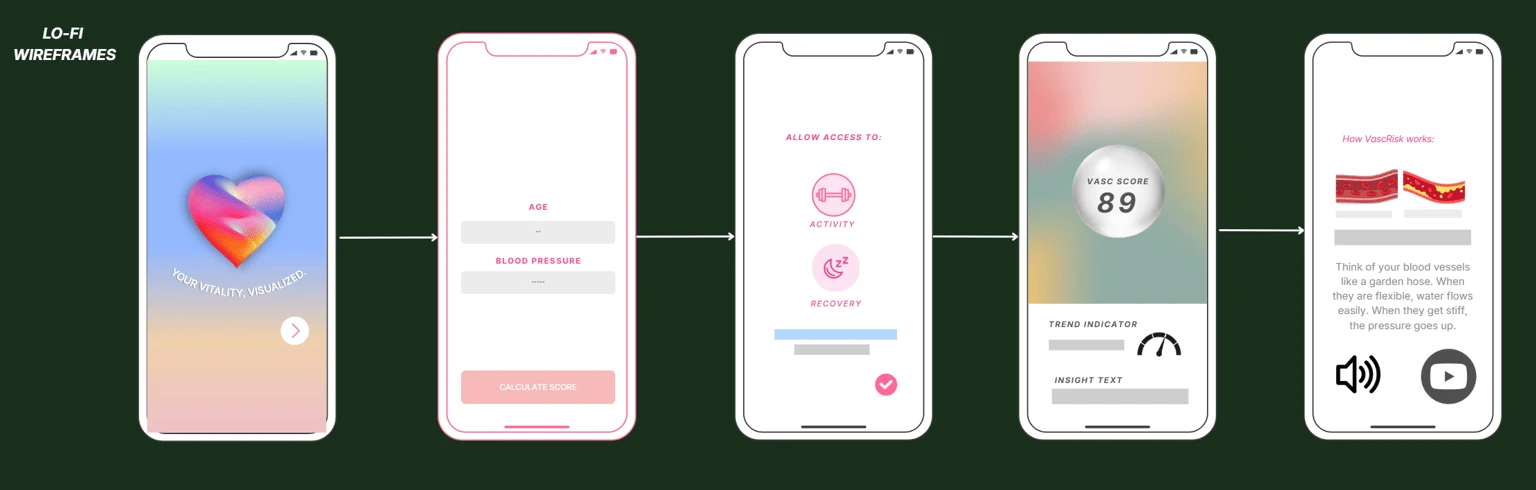
The VFS is the anchor — glanceable, personal, calibrated to the individual’s baseline.
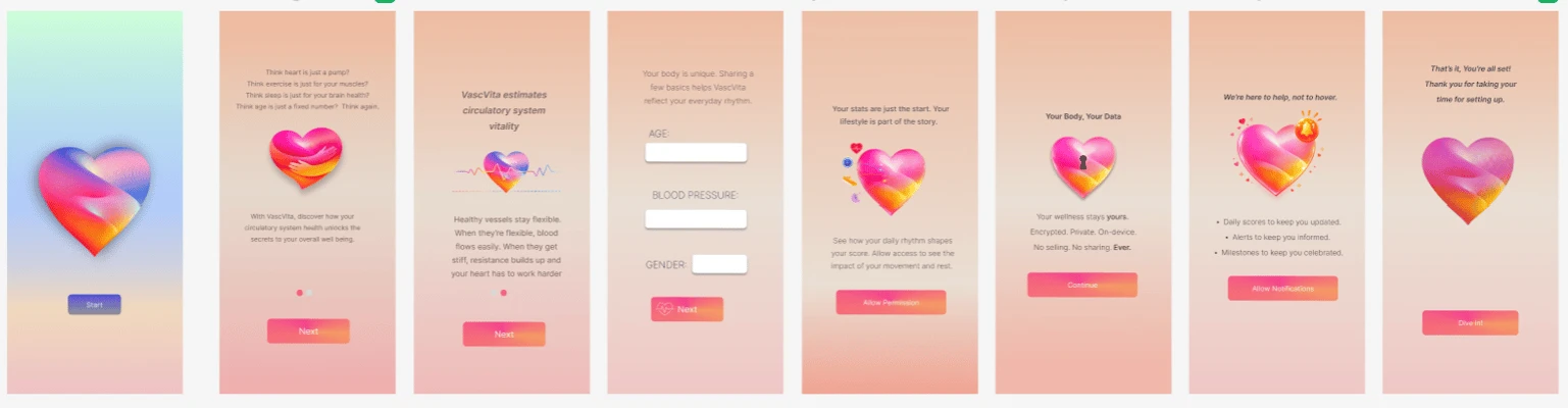
Users enter a simple baseline, then sync with Apple Health for movement and recovery. There is almost nothing to log.
Gentle insights and non-alarming language position VascVita as a general-wellness tool, not a medical device.
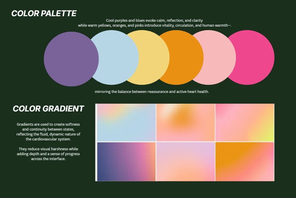
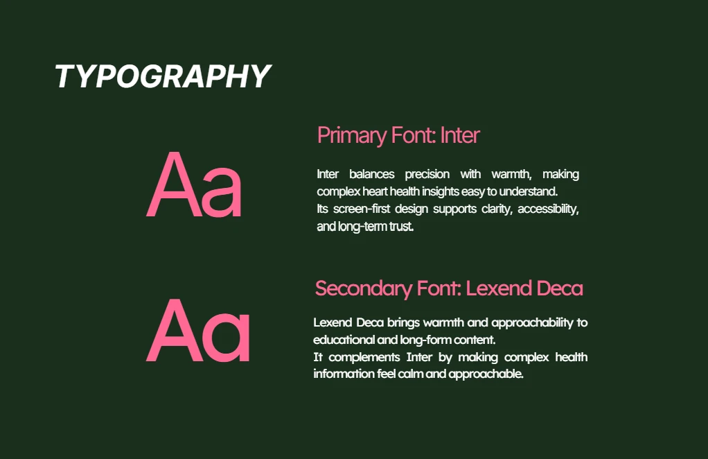
To keep the product consistent and hand-off-ready, I built a design system. It gave every screen shared tokens and gave engineering a single source of truth.
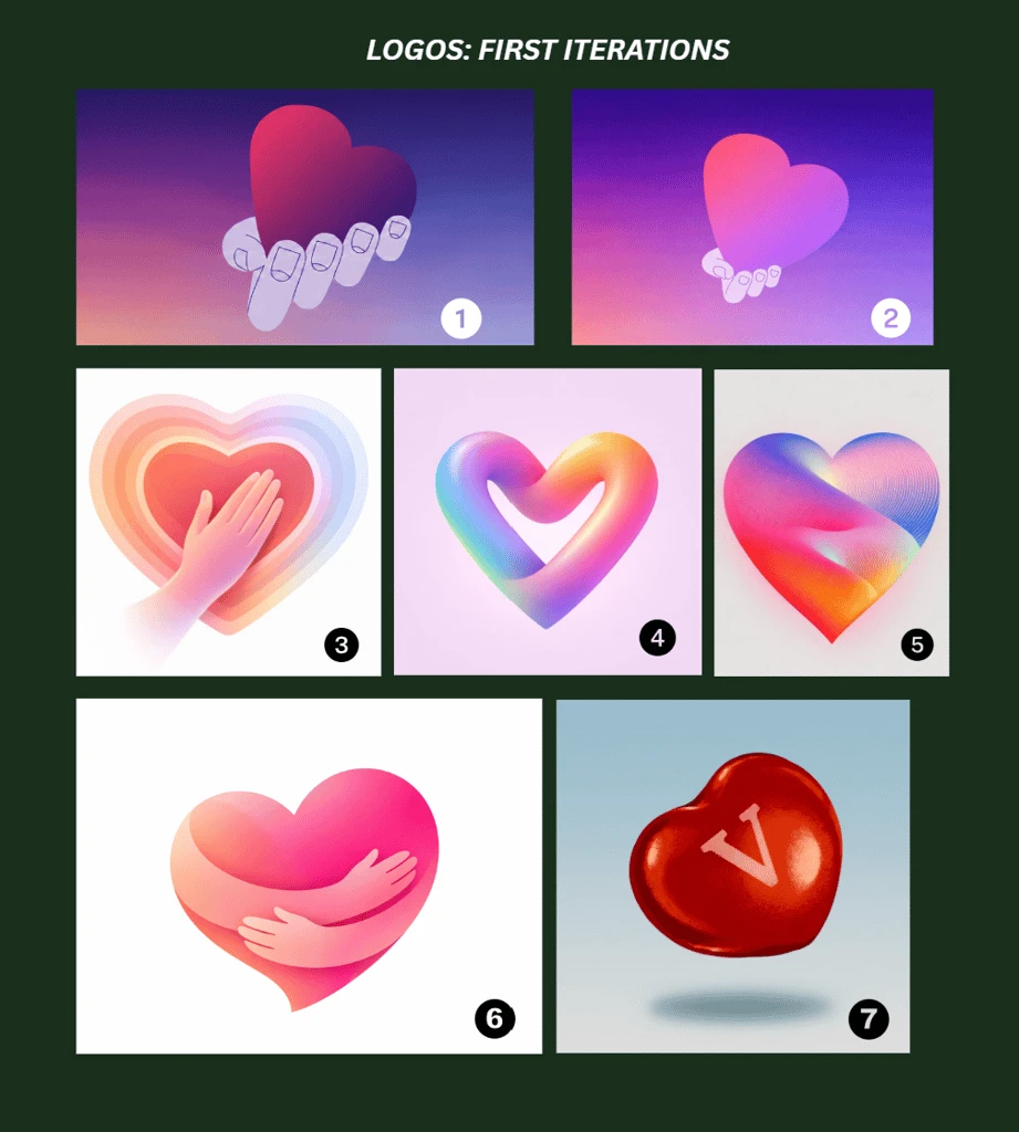
The logo went through several rounds; the team voted on the final direction — number 6.
The marketing microsite carries the product’s visual system and calm tone into its web presence.
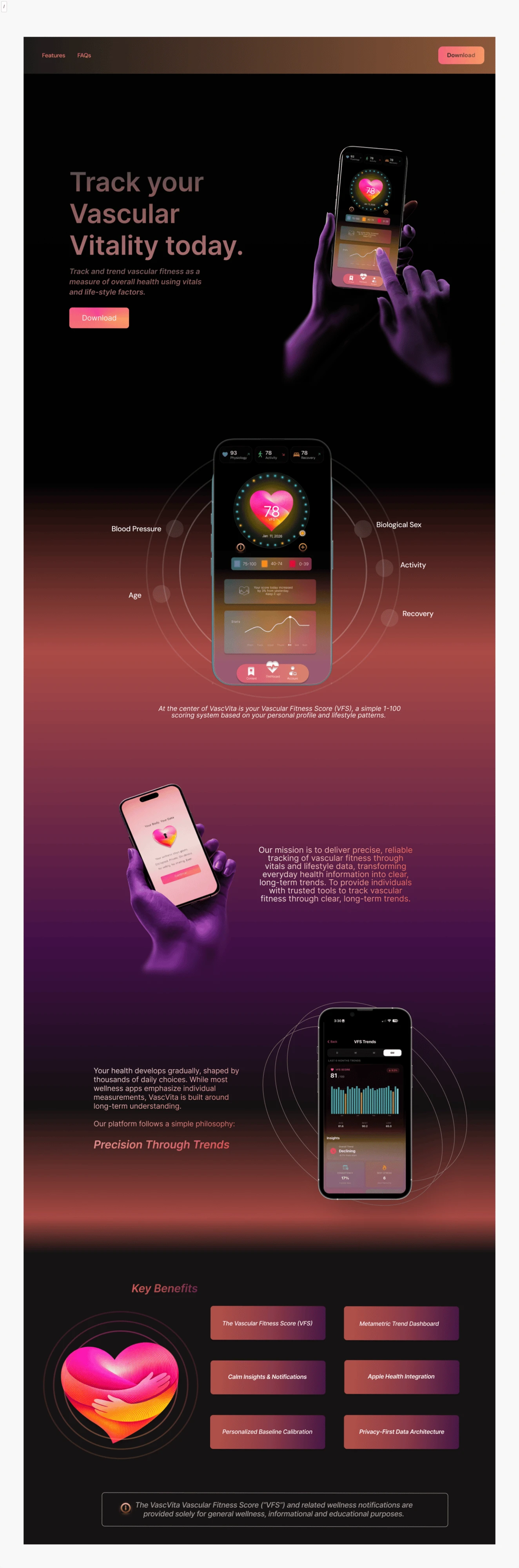
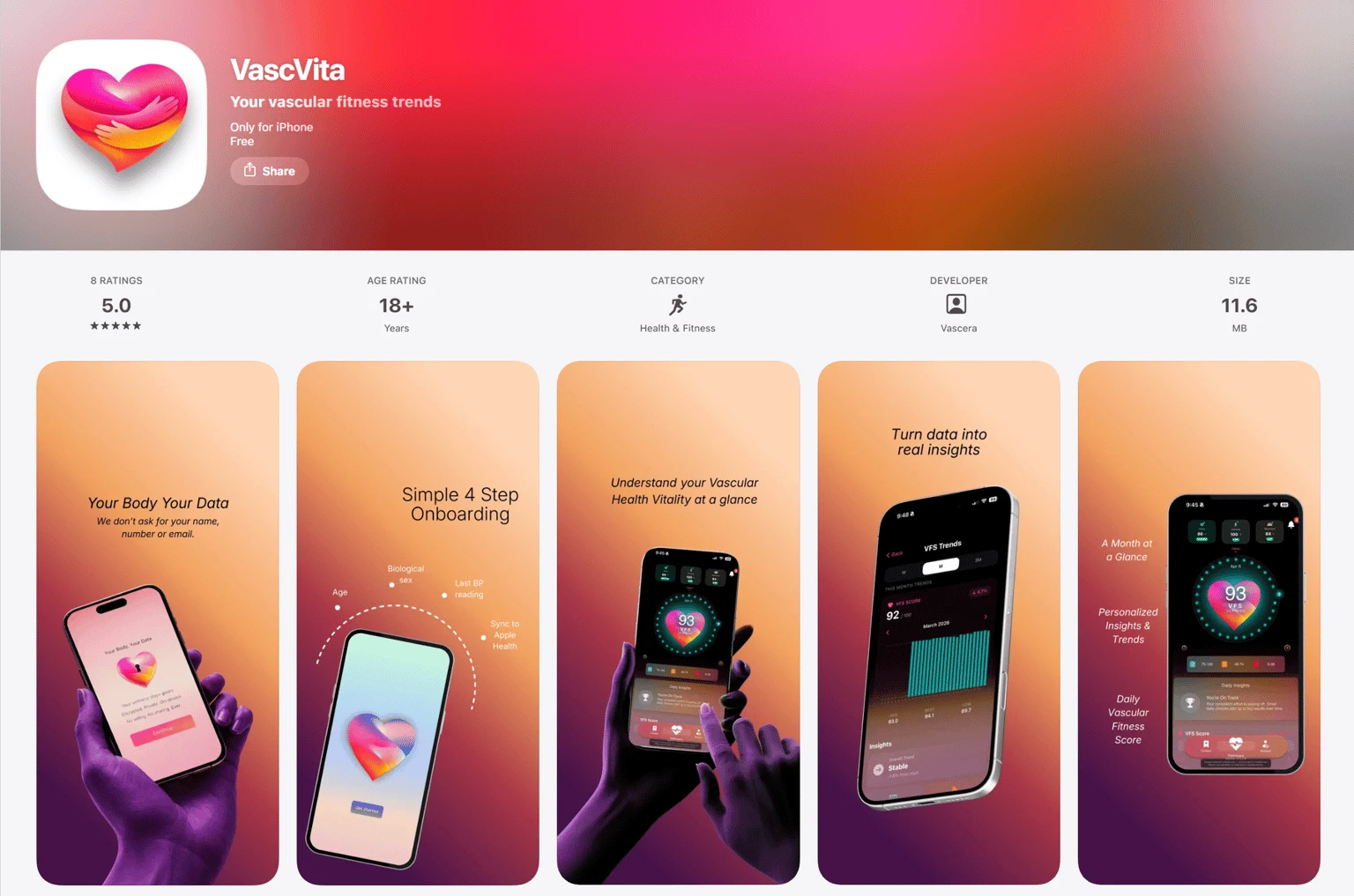
An end-to-end iOS experience, a shared design system, and a marketing microsite — brought together for a live App Store launch.
Design is often about restraint, not addition. In health design the reflex is to show more — more data, more precision, more alerts — because more feels like more care. But the people I interviewed wanted to feel less anxious and more understood.
Learning to design for that meant cutting, again and again, until a complex picture of vascular health became one calm number you could glance at and trust. Watching it ship taught me that the craft I care about most is knowing what not to put on the screen.